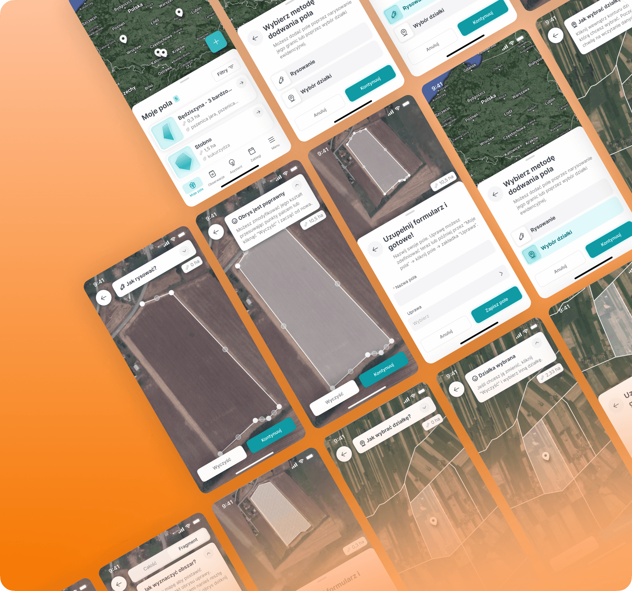
Tackling UX on a tight budget
How I turned 2 web flows into mobile with no reaserch budget
About
FarmPortal is a digital platform developed by AgriSolutions about 10y ago. It is aiming to help small-scale farmers and large agribusinesses manage their farms.
Challenge
As the sole UX designer with zero budget for research, I was tasked with designing the mobile version of company's 10y old flagship web app.
Impact
We reduced estimated onboarding time by 60% which enabled faster user activation & lowered the dropout risk.
My role
UX research, guerilla testing, UX design, UI design
Team
PO, CTO, Me as a Designer, FE Developer, BE Developer
Timeline
Some context
👩💻Do we have any data at all?
I was tasked with designing the mobile version of company's 10y old flagship web app - FarmPortal. The twist? No user data collected & no research budget available.
🌱 User onboarding as a starting point
We decided to start developing the mobile version with the "My Fields" - the platforms onboarding feature. By allowing users to register their farm plots, it unlocked all other functionalities and revealed the product’s true value.
"My fields" previous logic
🔃 Step 1: Adding new field
🔃 Step 2: Assigning a crop to the field
Secondary research
🧠 Heuristics evaluation findings
Once I got to know the golden path's steps, I ran a heuristic analysis to determine key pain points of the onboarding solution.
Add visual markers for field mapping process.
Enable clear editing of already mapped areas.
Declutter UI, let go of 2-colummn layout.
Get rid of unnecesary input fields.
Add tooltips with area mapping instructions.
Turn long form (13 fields!) into a wizard.
📉 Idea extracted from market analysis
As we still lacked direction, I proposed we run some market analysis. It revealed that competitors split map-engaging processes into two steps: define the field area, then fill a short form. This gave us our path forward.
Design explorations & guerilla testing
😵 Sketches & UX writing block
From IDIs with company lidership I knew that we had 2 user segments: tech-savvy big farm owners & more tech-reluctant smaller farmers. Concise and adjustable copy was crucial to adress those 2 very different contexts.
📋 Guerilla testing preparation
Ideally at this point I would have run some screening and then a proper usability testing. But with no research budget I turned to guerrilla testing with two internal testers.
Our agri-expert and sales rep – represented tech-savvy users from large enterprises.
A developer with a family-farm background – represented less tech-literate small/medium farm owners.
🕵️♂️ Task 1: Add a field
found the map interaction intuitive
moved through the flow without confusion
initially struggled but completed the task successfully after reading th helper text
🕵️♂️ Task 2: Assign a crop
found the instructional text unclear and withdrew from the process🤷♂️
found both labels too vague & suggested more contextual names
found the instructional text unclear and withdrew from the process🤷♂️
suggested using illustrations to demostrate logic of "manual" mode
🛠️ Implementing guerilla insights
It did not need any changes.
The expandable help text seemed to work for less experienced users & could be collapsed by those tech-savvy ones.
The flow was adjusted in 3 steps:
Rewriting instructional text to reduce dropout risk. ❌
Renaming crop assignment modes.
Adding illustrations.
Final design & learnings
🔃 Step 1: Adding new field
🔃 Step 2: Assigning a crop to the field
💡 Key takeaways
Guerilla tests can do the job
Even two test sessions gave us early signals on wording issues and interaction clarity. Sure it’s not hard-core data, but it helped us make some small adjustments.
More projects
Check out some more


